A pricing form that advises, then you edit
- Problem
- Sellers couldn't find the price, and the form asked a billing-mechanics question no seller could answer. Optional settings came first; the checkout preview sat at the bottom of the page.
- Solution
- First a reorder with an always-on preview. Then, when a regulation retired one plan type, two questions a seller can answer instead of a billing picker — and an AI advisor whose every number comes from a deterministic engine.
- Result
- Five front-door prototypes, a comprehension test with its decision rule written before the sessions, and a three-phase plan in front of stakeholders and engineering. No invented numbers across an 85-case automated test. Not in production.
Role & team
Design and front-end, built solo
- Designed every layer and coded the front end myself, directing AI coding agents.
- Validated with stakeholders as working prototypes; the August redirect is a written proposal in front of stakeholders and engineering.
Duration & scope
Audited 2023 · rebuilt 2026 · redirected Aug 2026
- First audited the plan booking and upgrade flows in 2023; a plan-booking redesign carried the first fixes in 2025.
- In August 2026 a regulation retired one plan type, and the question changed from how to lay the settings out to what to ask the seller.
Receipts
No invented figures, and a gate that keeps it that way
- Every number the advisor shows comes from the deterministic engine, never from the model — zero invented numbers across the whole set.
- All 44 production settings accounted for. One legal cap found unenforced; the prototype now blocks the save.
- Prototype status stated plainly: not in production.
At ablefy, a creator-commerce platform, every sale starts in one form: pricing model, price, payment methods, schedule, trial. Sellers couldn't find the price — a design audit and two rounds of feedback kept finding the same things: flat hierarchy, optional settings placed ahead of the mandatory price, payment settings split across two unexplained fields, and the checkout preview at the bottom of the page.
I rebuilt the form in layers and coded the front end myself, directing AI coding agents. Then, in August 2026, the project changed shape: consumer-credit rules retired one plan type, engineering asked for a refactor instead of a re-skin, and the design question moved from how to lay the settings out to what to ask the seller. The second half of this case is that redirect.
The form sellers fought with
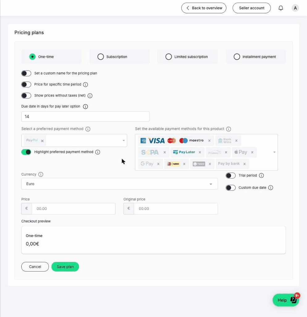
The problems weren't cosmetic. The audit and two feedback rounds grouped into one pattern: sellers couldn't find what matters, got too much too soon, and didn't understand the words.
I first audited the plan booking and upgrade flows in 2023; a plan-booking redesign in 2025 carried the first fixes. By 2026 the accumulated case justified rebuilding the form itself.
 View full size
- Pricing type, payment, currency, schedule and trial all carried equal visual weight — no hierarchy.
- Optional toggles appeared before the one mandatory field: the price.
- Payment methods lived in two redundant fields (“preferred” vs “available”) with no explanation.
- Plan-type names confused people — subscription vs. limited subscription vs. installment.
- The checkout preview sat at the bottom, so checking your work meant scrolling on every edit.
Early 2026 — reorder the form around the order a seller decides in
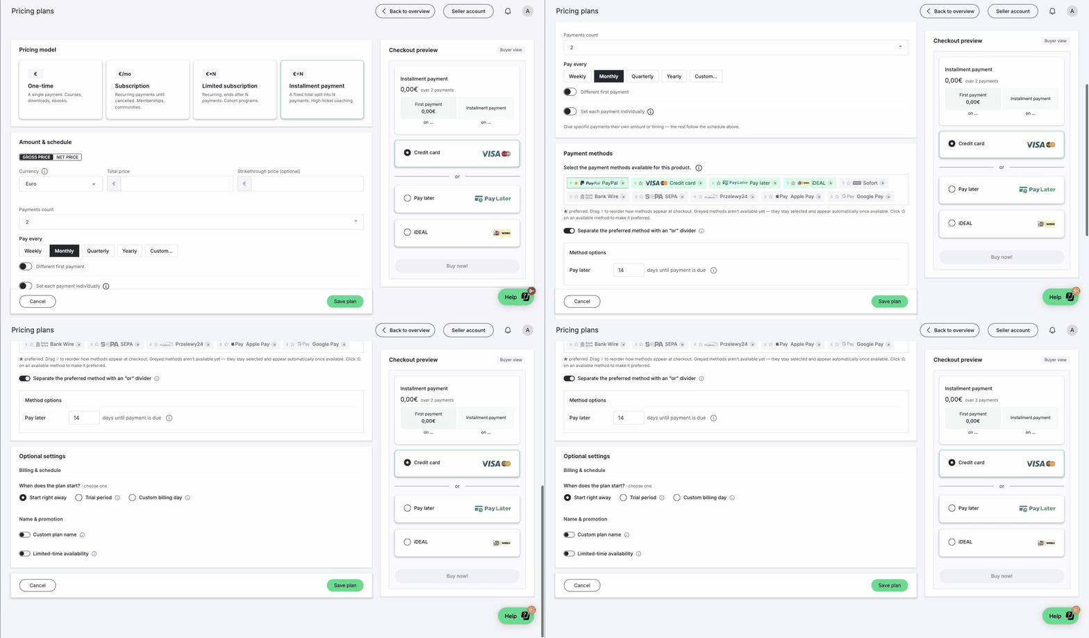
The first answer is information architecture before it is visual design: the form reorders to match the order in which a seller actually decides — what am I selling it as, what does it cost, how do people pay, and only then the optional extras. Payment methods consolidate into one field, and the checkout preview moves beside the form — always visible, updating as you type.
The same controller engine carried a spin-off cheaply: an offer builder for sales calls, with an editable per-payment timeline that rebalances the other payments when one changes so the total never drifts.
 View full size
- 01
Pricing model
The four plan types the form had then, moved to the front — everything below depends on this choice.
- 02
Price & schedule
The mandatory part, no longer buried under toggles.
- 03
Payment methods
One consolidated field with logos, ordering and a preferred method.
- 04
Optional settings
Trials, custom names, availability — after the essentials, not before.
The editor I proposed, and what the review changed
The second layer let power users edit the plan directly on the payer-facing preview — change the thing you're looking at, instead of a form that describes it. The idea survived. My first shape for it did not.
What I proposed
A standalone editor page: the checkout as the whole surface, with every plan setting editable in place and the form left behind.
What the review said
A second place to edit pricing would split the seller's sense of where prices live, and anything the two surfaces disagreed on would have to be reconciled by hand. Rejected — rightly.
What I changed
An overlay on the same redesigned form, sharing one state underneath, so there is one place prices live and two ways to look at it. It landed.
What landing it cost
The design-system tax: rebuilding the prototype's controls on the platform's own components instead of one-off colours that would fork from production.
August 2026 — the form was asking the wrong question
Three things arrived at once. Consumer-credit rules, applying from 20 November 2026, retired the installment plan as a seller choice. Engineering asked for a refactor of the pricing services rather than another re-skin, which removed the constraint that had shaped every earlier prototype — a pure front-end change that saved exactly what the old form saved. And the requirements document diagnosed the real problem correctly: the form asks a billing-mechanics question when the seller only has a business answer. Then it prescribed three better names on the same picker.
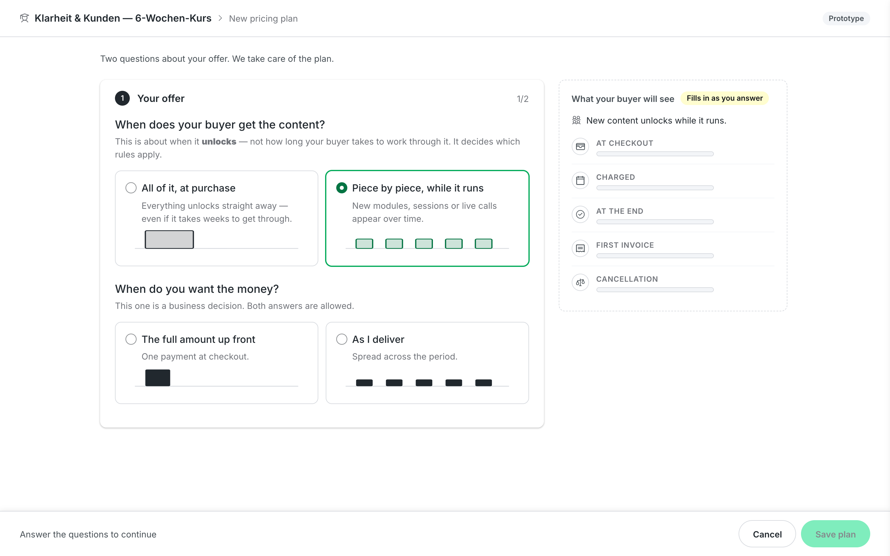
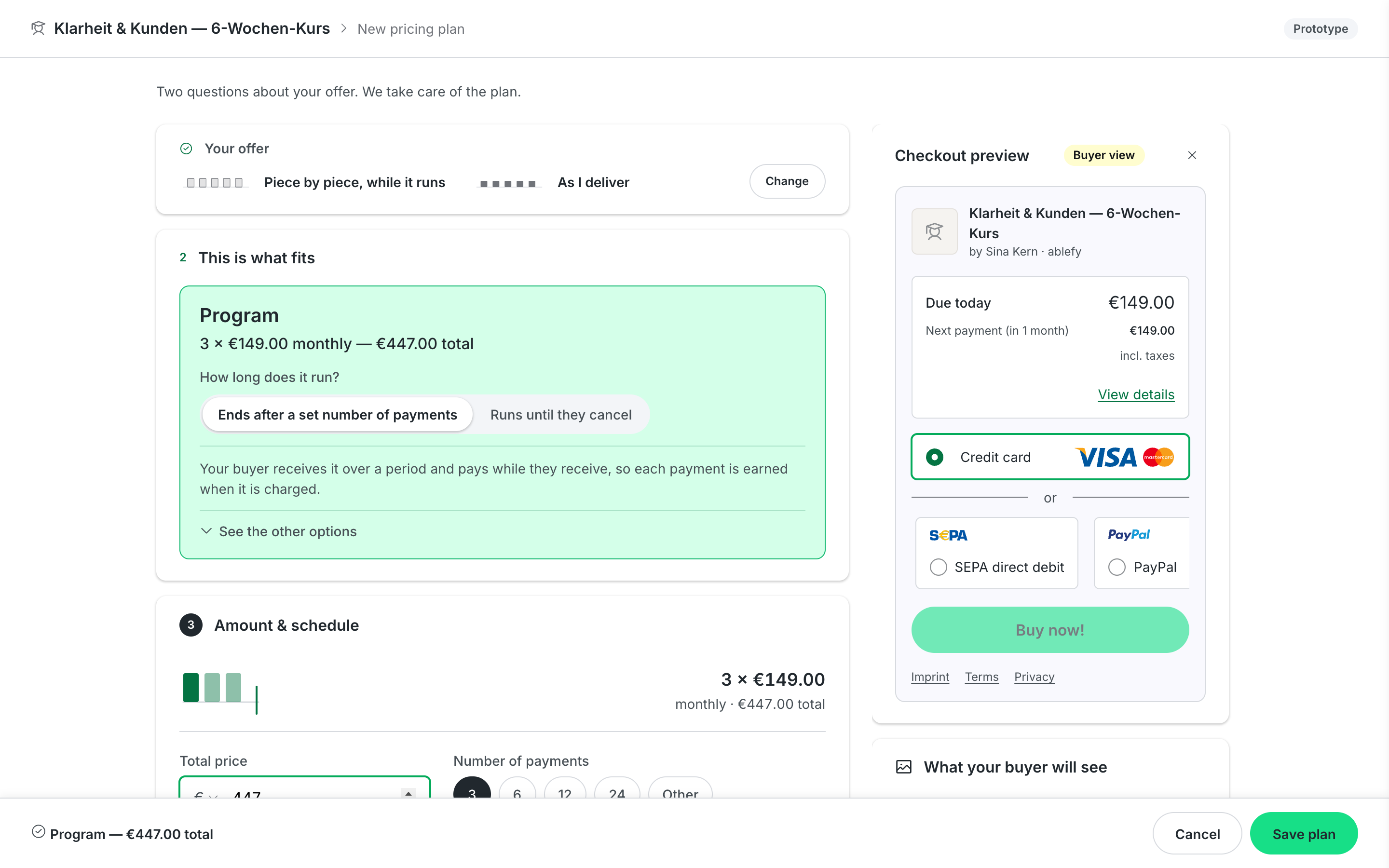
I argued that a relabel cannot fix a recognition problem, and proposed changing the question instead. Two questions a seller can answer, in this order, and the plan type becomes a result the seller can read and override rather than a cold choice. Underneath, one saved structure that a manual, an assisted and an AI version fill to different depths.
The evidence was already in the data. Roughly nine in ten instalment orders used one single configuration, so the form's other settings were noise for almost every seller. And across 205 recorded seller calls the word “installment” never occurs — the people explaining it say “payment plan”.
The “limited-term plan” rename from the second layer did not survive as a name; the product calls the type a Program. What survived was its legal grounding: delivered once versus over a period decides both the VAT treatment and the credit rules, and that distinction became question one.
 View full size
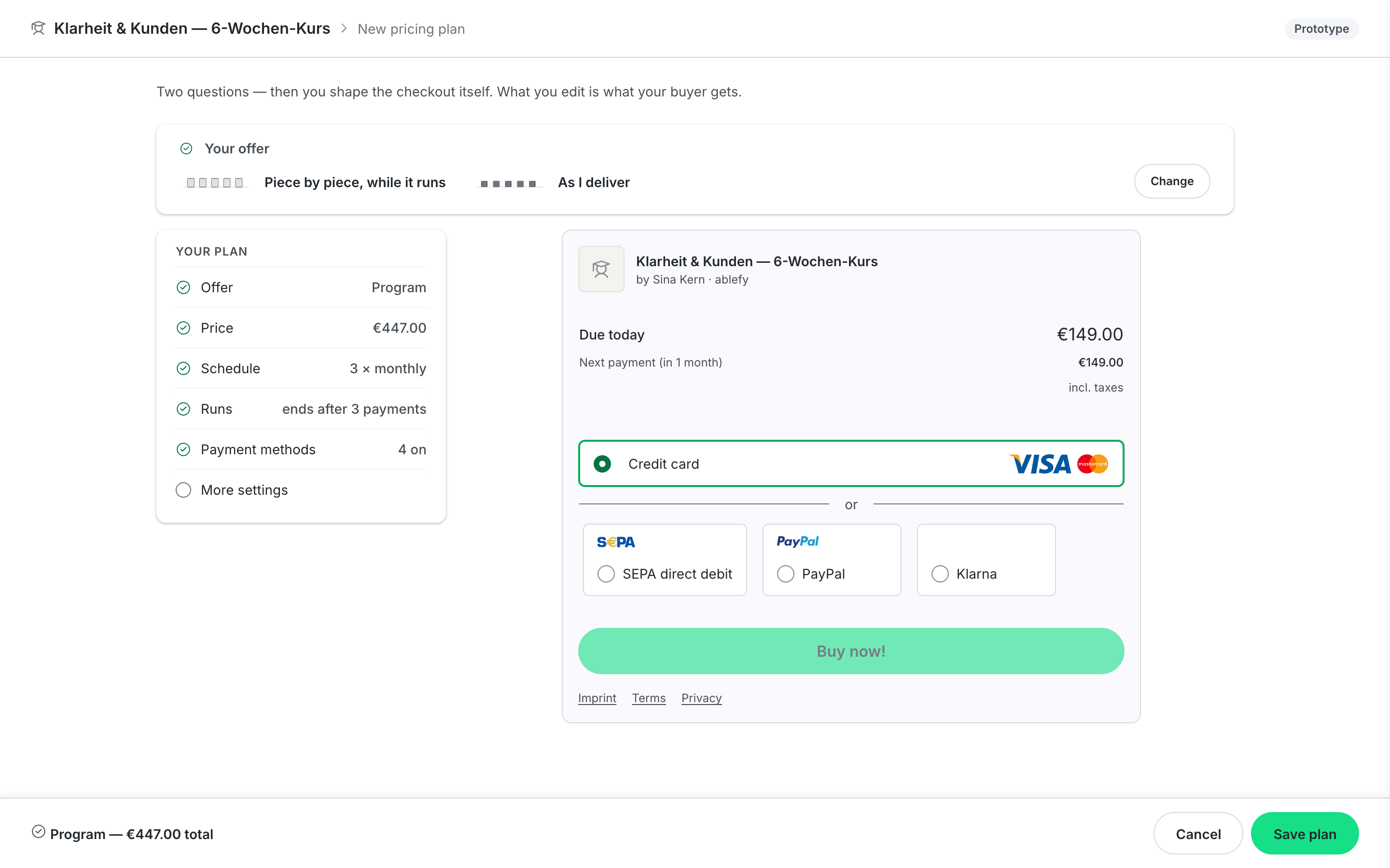
1 · When does your buyer get the content?
All of it at purchase, or piece by piece while it runs. This decides which law applies, so the seller answers it and the system never guesses.
2 · When do you want the money?
The full amount up front, or as you deliver. A business decision with both answers allowed — and the only place assistance belongs.
Five doors, one test, and a rule written before the sessions
Which door is right is not a debate to win in a room. I built five front doors on one shared offer profile, each testing a different seller strategy: choose the shape, describe the offer in two questions, pick the closest template, start from the money, or say it in one sentence. Two earlier variants were cut because they were variations of one door — one hid a label, one paginated the same two questions — and a test between them would have measured copy, not a design idea.
Before any seller saw the copy, a synthetic seller panel — six personas grounded in real seller voice history, labelled synthetic and treated as hypotheses only — read the first question as how long the course lasts rather than when it unlocks, on the most common product shape. That answer would have been legally wrong. The question was rewritten to ask about unlocking, and the door that guessed a delivery shape from the word “course” stopped guessing.
Then the comprehension test: the form against the buyer's page as the editing surface, between subjects, three sellers per arm, with the decision rule written before the sessions so the result cannot be argued into the room's preference — a tie ships the smaller change. The instrument is done. Round one has not run, so there is no comprehension number on this page.
 View full size
 View full size
 View full size
Nothing dropped by drifting out of a mock
A redesign that simplifies is a redesign that removes, and removal by omission is how a power user loses the setting their business runs on. So every control the live form renders was read out of the production code with its real limits and classified — keep, quiet, gated, dropped or open — each with its evidence and an owner. The rule: simplify by defaults, never by removal. A low-use setting moves behind a working default; it does not disappear, and an open question is not resolved by a prototype that forgot it.
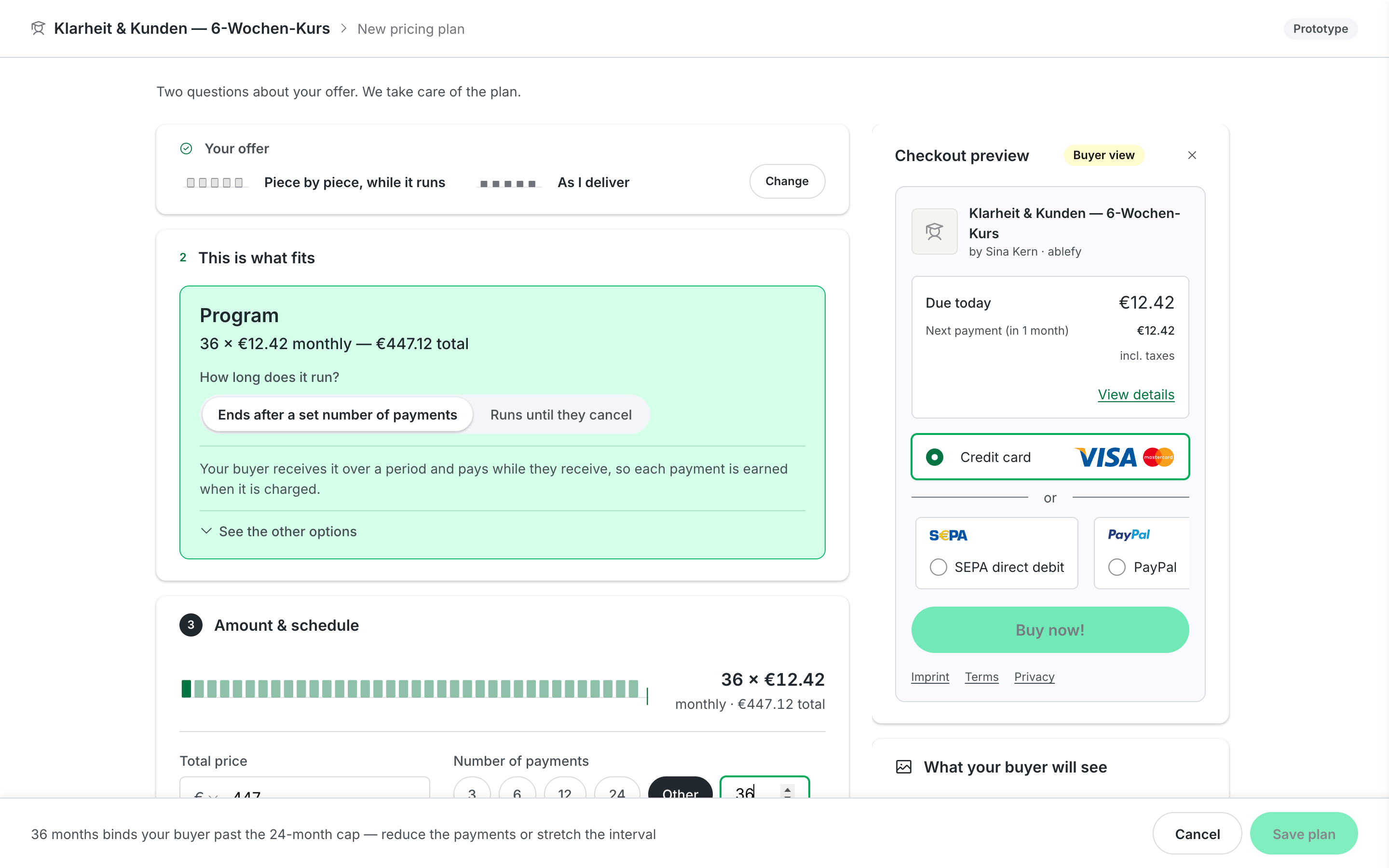
The inventory found something the form itself did not enforce. Consumer law caps a standard-terms commitment at 24 months; the field was uncapped, and live plans ran past it. Legal confirmed the cap as a hard limit. The prototype now blocks the save whenever the number of payments times the interval exceeds it — the cap follows the commitment, not the field, because 36 monthly payments bind a buyer exactly like a 36-month minimum term.
 View full size
44 production settings44 in total, every one accounted for
26 built · carried into the design, first-class or behind a working default
6 moved · leave the plan builder for a named destination — promotion settings go with promotions
10 open · undecided, each with a named owner; the prototype may not resolve them by accident
2 dropped · removed on purpose, with the reason on record
An advisor, not an authority
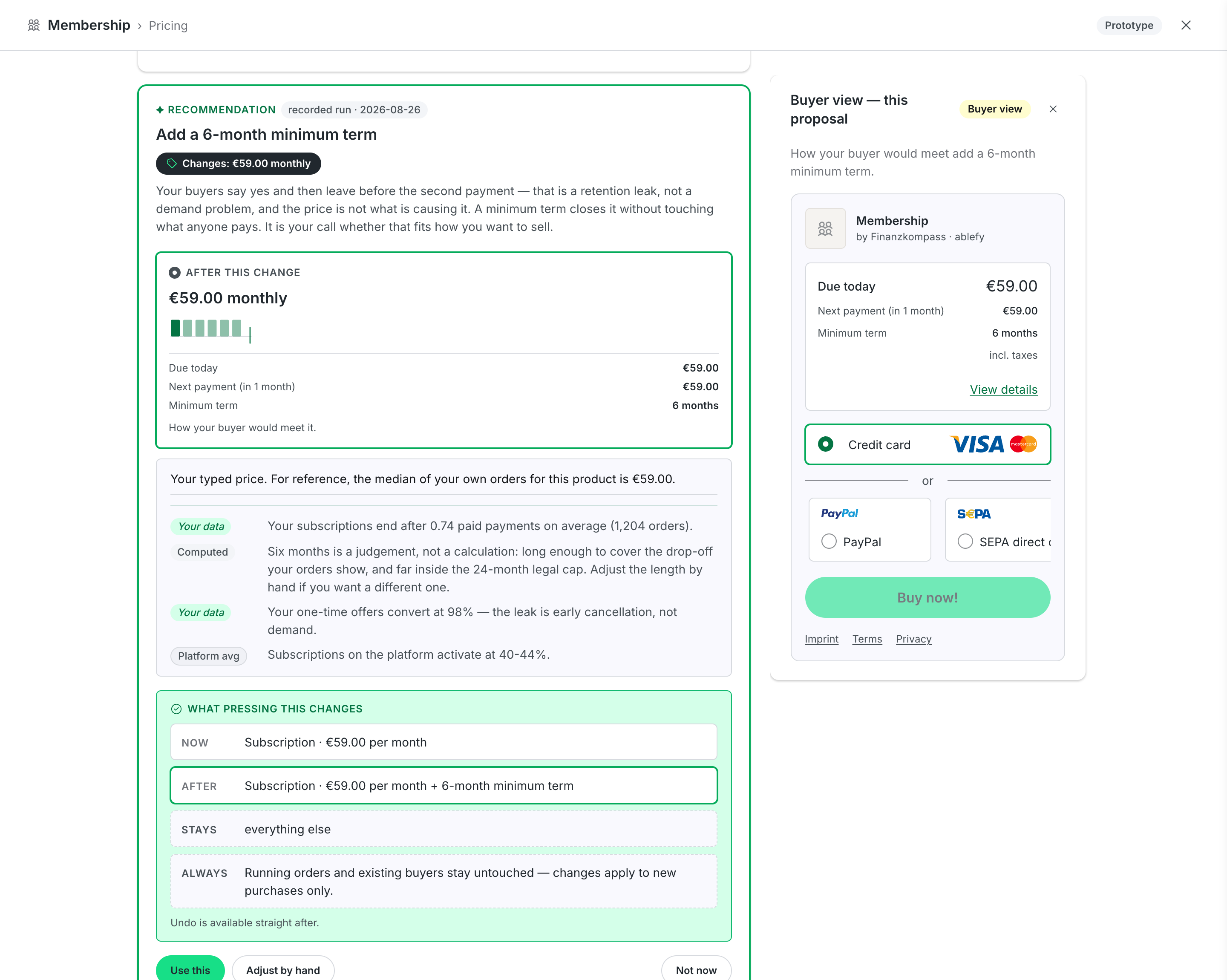
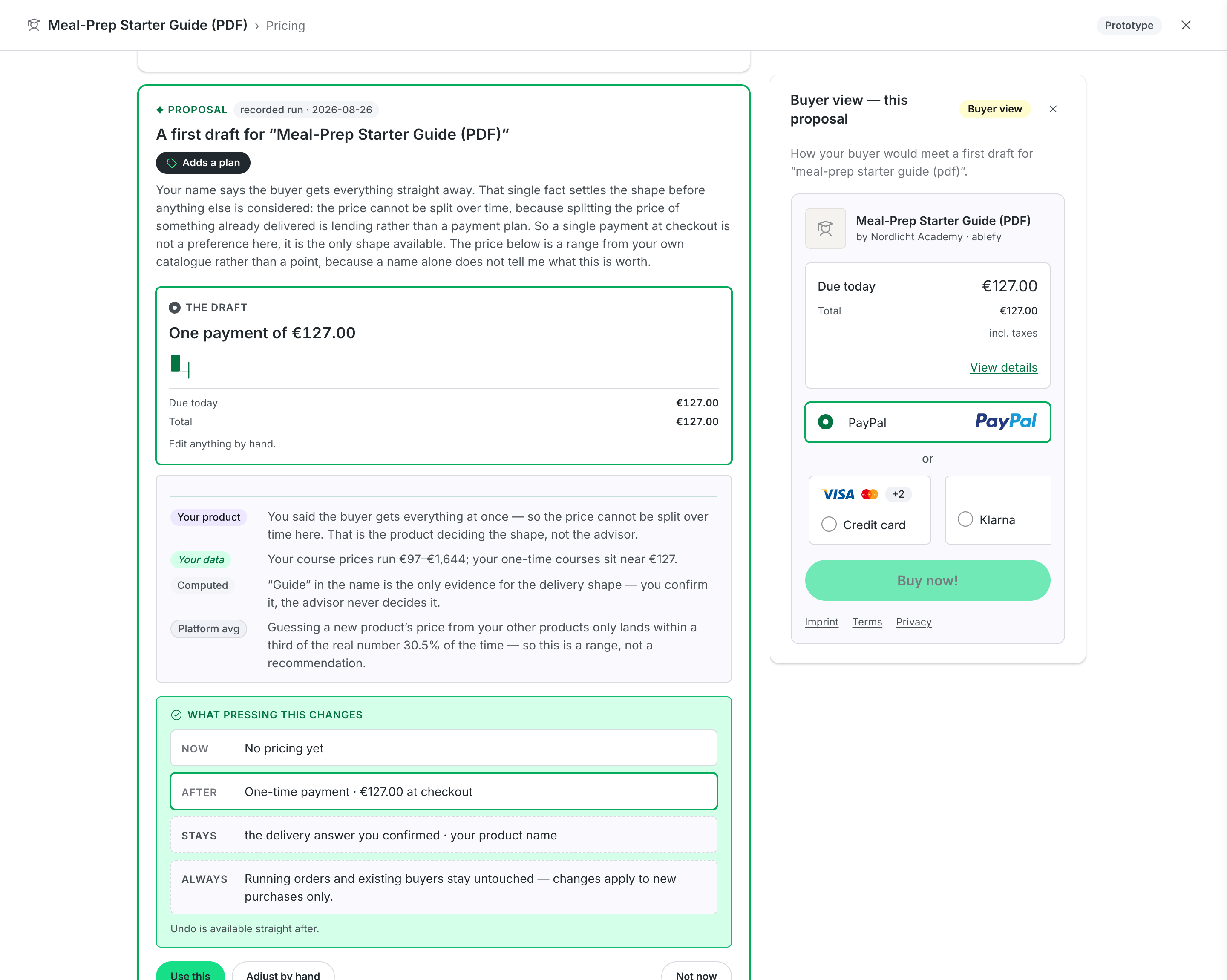
The third layer flips the paradigm: instead of configuring a form, the seller states a goal — cash flow, conversions, completion — and the advisor proposes a pricing structure with a plain-language reason and the money consequences up front. Since August it runs on real order data, pseudonymised, and it enters from the product a seller is looking at rather than from a menu.
The trust question here was never whether the advisor could produce a plausible answer. It was whether a seller would know when to trust it — and these recommendations move real money. So the interaction model was fixed before the advisor existed, on one decision: separate the recommendation from the outcome. The model may propose a pricing strategy and explain its reasoning. It may not determine the final numbers.
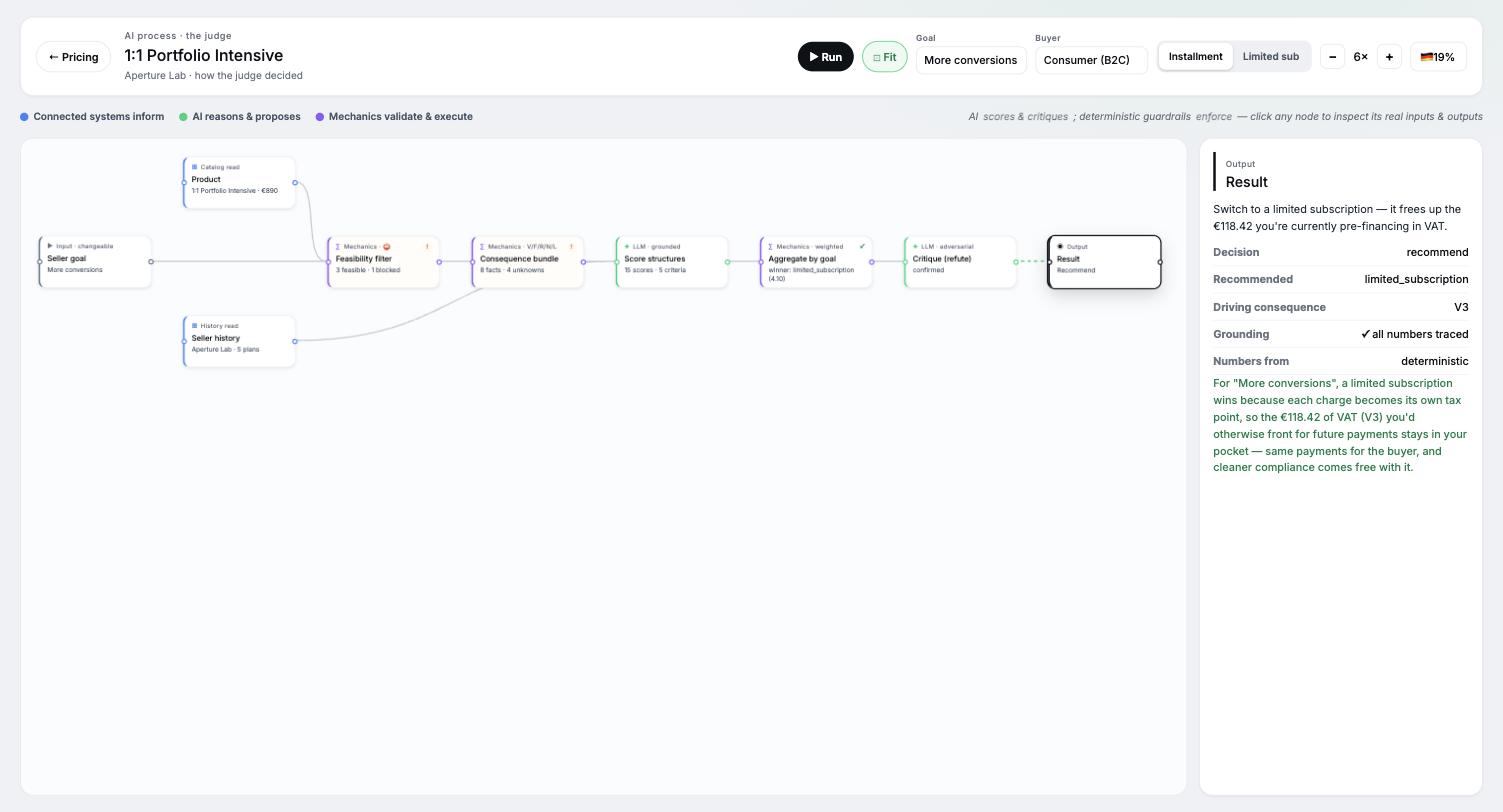
An AI that recommends prices has one failure mode that kills it: a made-up number. So the work is split. The language model proposes and scores options, argues trade-offs and writes the rationale; a deterministic engine computes every number, filters what is feasible, and arbitrates what the model may claim. If the two disagree, the mechanics win. Before anyone saw a recommendation I gated it on exactly that failure: across an 85-case eval set and two live runs no invented number appeared, and 12 deterministic graders and type checks still have to pass on every change — a standing gate, not a score I got once.
 View full size
 View full size
- 01
State a goal
Cash flow, conversions or completion — in the seller's terms, not the form's fields. Compliance is not on this list: it is a floor, not a goal.
- 02
Read the recommendation
A proposed pricing structure with a plain-language reason — or “nothing to change”, which has to be an allowed answer or the advisor is a machine for churning prices.
- 03
See the consequences in euros
What lands in the account now, what the buyer sees — beside the recommendation, before any decision.
- 04
Read where each figure came from
Every figure carries its basis on the figure: the median of the seller's own orders, a platform benchmark, or a judgement that says it is one.
- 05
Change anything
The advisor drives the same plan model as the manual form, so every field it filled stays editable by hand.
- 06
Save the plan
The seller commits it, with what changes now, what changes after and what stays untouched stated first — and an undo.
Three things I reversed in the AI layer
The advisor changed more between June and August than any other part of this case, and each change came from watching it be wrong in a specific way.
 View full size
The glass box, retired
In June every node of the decision was clickable — a pipeline window that read as proof. Over recorded runs it over-promised: a live-looking pipeline implies a live computation. It left the product. What replaced it puts each figure's basis on the figure itself, where the seller is already looking.
The product decides the shape
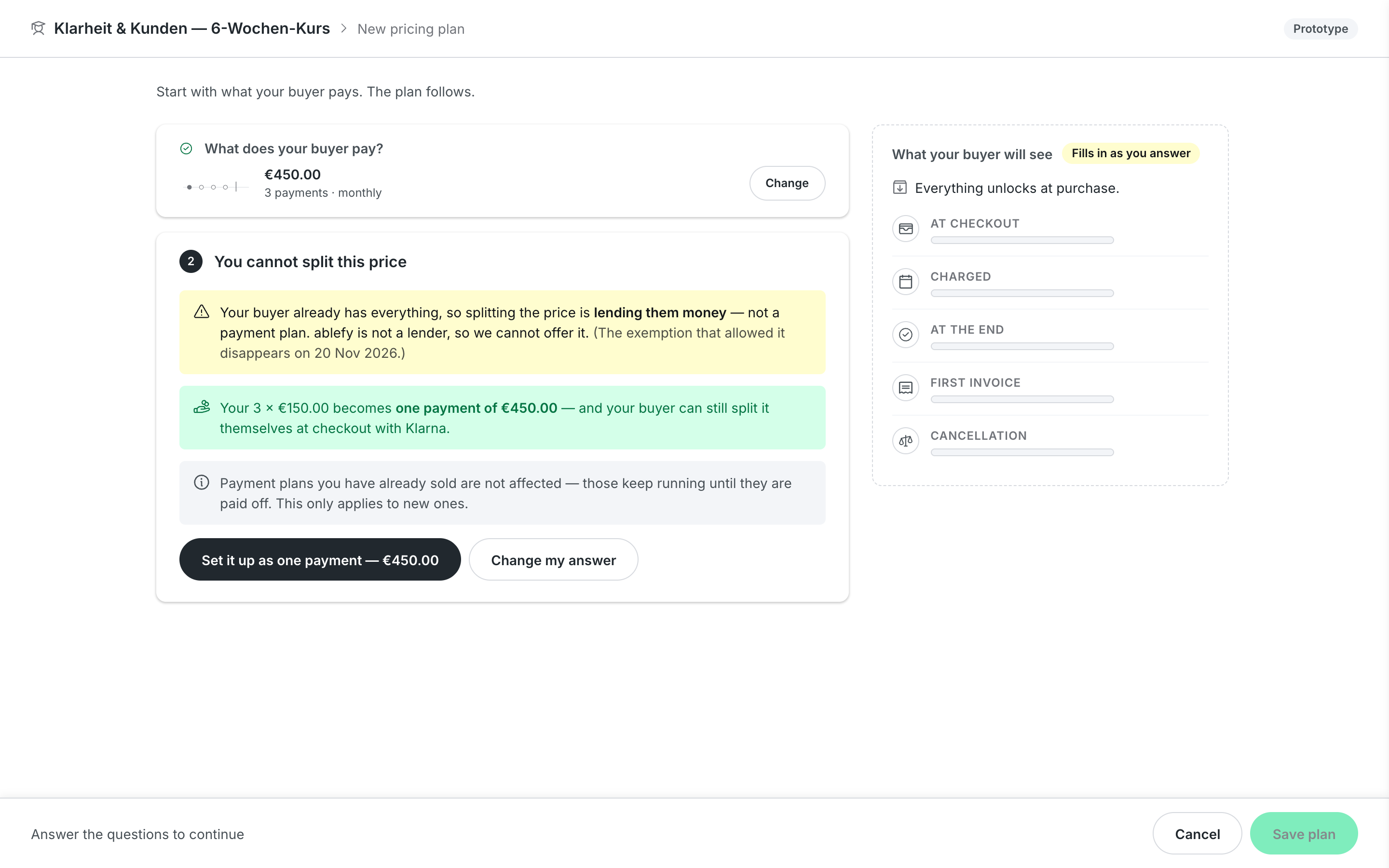
The advisor proposed splitting the price of a download, because its guard read the seller's history rather than the product. Splitting the price of something already delivered is lending, not a payment plan. The fix was one source for the delivery fact, read by both the wording and the rules.
Compliance is a floor, not a goal
Compliance sat in the goal row beside cash flow and conversions. A single choice that contains it states a trade-off that does not exist. It left the row; the rules apply whatever the goal.
What the advisor may learn
The rule for feeding it: a valid use case becomes advisor knowledge; a workaround becomes a design fix and is never taught to the advisor.
Where it stands
The redirect is a proposal in front of stakeholders and engineering as a three-phase plan: the front door and the saved offer profile first, then the same screens arriving pre-filled from what the product already knows, then the advisor. Migration is decided: running orders finish, plans that no longer conform close to new buyers and stay alive, new plans use the new design.
The comprehension test's instrument is ready and round one waits on recruiting. The prototypes are standalone builds; the early-2026 form sits in the shared demo build behind a flag. Nothing here is in production.
What carries beyond the prototypes: the two questions, the settings inventory and the legal cap it found, the rule that every figure carries its basis, and one lesson from the AI layer — trust in AI judgment comes from the deterministic mechanics arbitrating, not from a better prompt.
In parallel with the form work I led the platform's charging-model research — a cross-team demand inventory, a build-vs-buy scan of the billing market, and a usage-based pricing recommendation — the strategy layer this form ultimately serves.